
Strategic Filters – Character design
Let’s talk about a common problem that all creative people have to face: the dreaded feedback session.
Before I get into the heart of the discussion, I should preface it by saying that you should never ask for feedback if you are in fact looking for validation. If you aren’t willing to at least consider some aspect of validity to the feedback you are soliciting, then do yourself a favor, and don’t ask for it.
Now, the very fact that someone offers you suggestions or constructive criticisms doesn’t mean you have to accept them. You’re under no obligations to do so, obviously. But you are under an obligation to consider the feedback objectively. Sometimes, the suggestions aren’t well articulated, and rather than accepting the critiquer’s suggested changes, you need to understand what problem they were reacting to. If you can deduce the problem, you can then either accept their solution, or think up one of your own. In either case, the process can be useful.
That’s all fine, and for the most part, creative people understand this, and have heard this advice before.
But I’d like to talk about the other side of the equation. I’d like to talk about the role of providing feedback. In my experience, very few people are able to demonstrate a great deal of precision in this area. Inevitably, the bulk of humanity can be distilled into a handful of types.
You’ve doubtless already encountered Sally Self-Esteem. She’s the uber-supportive close friend or relative who only offers praise or the occasional ticky-tacky fluff suggestion. Good for the ego, but not terribly useful. And then there’s Bob Bitterman. He’s the self-proclaimed expert who attacks everything in detail, offering a tactless evisceration of your work, characterizing everything as flawed, so that he will, in fact, often identify real flaws, but they’re buried under an avalanche of useless negative garbage.
Luckily, Sally and Bob only represent a small percentage of the feedback-giving world. Most of us are like Ted Tactical. We can spot hitches in an animation, or poor proportions in an illustration. We can find seams in the texture maps, and can point out inconsistent styles. With a bit of careful examination, we can identify a handful of clear details that could be improved. And if we’re nice people, we try to balance the positive with the negative. We use tactful language for the stuff that needs improvement, and are sure to praise the things that were done well.
So what’s wrong? Isn’t Ted a good model to aspire to? Not really. The problem is that Ted is tactical. He’s providing feedback without a plan, and focused so intently on the details that he can’t see the big picture. He’s seeing some of the trees, but the forest is lost on him completely. He’s relying too heavily on experience and an eagle eye, with the inevitable result that he’ll find some issues, but they’ll be isolated and shallow. He’ll probably miss the important stuff entirely.
What we really need to do in order to provide useful feedback is to elevate our point of view. We need to be strategic. That’s where Strategic Filters come in handy.
So what are strategic filters?
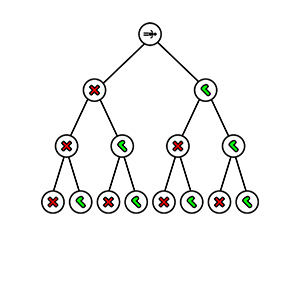
To put it succinctly, they’re a set of hierarchical rules, filters if you will, that enable us to categorize the various elements of the work we’re evaluating. Strategic filtering is a heuristic approach that ensures that our feedback is logically cohesive, and contributes suggestions that are not limited to simple isolated flaws. In aggregate, the issues we can point out in our feedback will be connected in such a way that the end result exceeds the sum of the parts. We can point out patterns of flaws, so that the even the things we fail to notice can be seen by the author whose work we’re evaluating.
Let’s walk through an example. The process works on lots of things, from a animations to game mechanics, from UI to voice acting, or lighting, or lines of dialogue. But for now, let’s say we’re reviewing a character design.
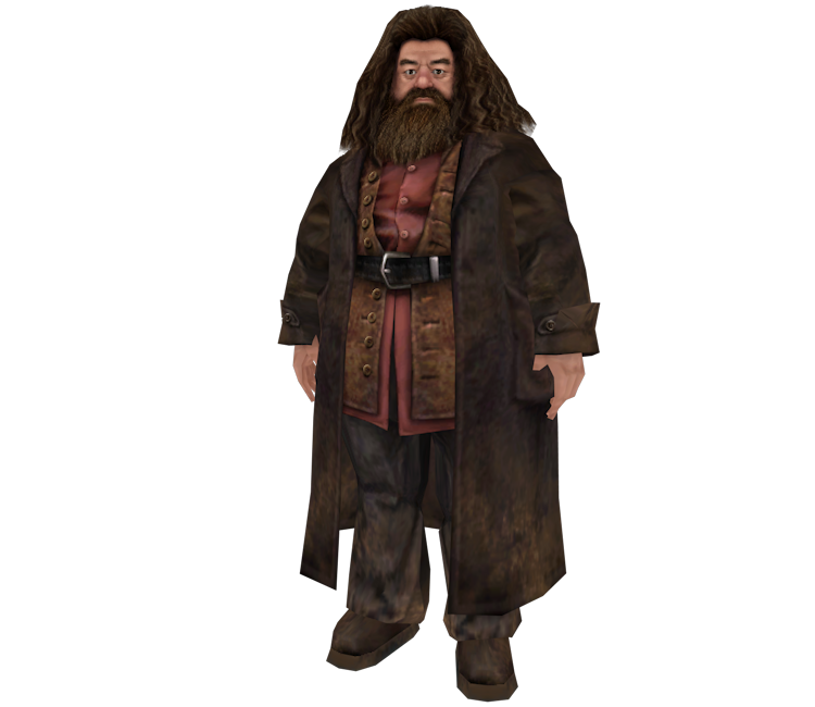
Before we even glance at the illustration, we need to map out our approach. Let’s start at the highest level. Let’s identify the most fundamental, pervasive attribute of the overall environment: the character’s purpose. This could be any character in the story’s universe, so in order to work with something concrete, let’s assume our game is based on the Harry Potter universe. It’s an easy example, since most of you will be familiar with the story. Now let’s say we’re in the process of creating the character concept for Hagrid. He’s a big, hulking guy who serves as a combination big brother to Harry and general purpose bodyguard/minion for Dumbledore. He’s equal parts intimidating and lovable. He’s not the brightest bulb in the box, but has a heart of gold.
Now that we understand the character’s purpose, we need to understand the subtleties. In context, the Hogwartz world might be described as whimsically dangerous. Things are magical and cute, but can sometimes kill you in spectacular ways. This overall tone becomes our second filter.
But we won’t stop there. We can evaluate an art asset in lots of ways. Even though this is an illustration, eventually it’s going to be turned into a 3D model. That means there are going to be plenty of technical considerations. We have to look at the illustration through the filter of poly counts, dangling objects, hair, cloth, etc. It’s easy to draw these things, but we need to look at the illustration through the lens of its eventual implementation, and the technology that will be involved, because that will impact animations, performance, and a host of other elements. So tech constraints is definitely a third filter.
Of course, it’s art, so aesthetic criteria have to be considered too. Is the illustration stylistically consistent with the rest of the world? Does Hagrid look like he belongs not only in Hogwarts, but does he look consistent with the other characters we’ve already concepted? How is shape language being employed? Do the proportions feel right? Is the illustration conforming to a standardize palette? The aesthetic component will be our fourth filter.
If we put some thought into it, we could probably come up with another category or two of filters, but for our purposes, this list will suffice.
What we’ve done is create a rubric. We have four categories of criteria: Purpose, Tone, Tech, and Aesthetic. The next step is to take a deeper dive on each of these categories. Make a list for each one. Include specific-but-qualitative examples of what you want to see under each category. Our detailed breakdown might look something like this:
Purpose – <provide the character’s purpose here>
- Does the costuming accentuate/demonstrate the role/tone?
- Do the props contribute to the functionality?
- Does the character’s silhouette convey its function?
Tone – <Provide the fictional tone of the world and the character here>
- Does the illustration convey the required attitude?
- Will the color palette evoke the correct emotional response from the audience?
Technical Constraints
- Will the design create technical /performance challenges?
- Can the character’s animation rig be repurposed for other characters?
- Will the design require special shaders or procedural animations?
- Does the character have any soft-body properties or other considerations that will require special physics?
Style/Aesthetic
- Is the character consistent with the environment?
- Is the character consistent with other characters?
- Is the use of shape language consistent with the character’s intended role and tone?
- Are the proportions appropriate for the intended style?
- Do the color choices adhere to the style guide palette?
- Is the detail level consistent with the style guide?
- Is the style consistent with the fictional genre and overall tone of the world?
After you’ve compiled a first-pass list, then compare it against art assets from a completed project. Look for aspects you’ve missed. Sometimes consulting the bug lists from that project can serve as a good guide. What sorts of issues commonly resulted in the asset being rejected? From there, it might be useful to run your list past a few different artists. Polish off the fine details. The list above is very short, and with some time and effort it could be considerably expanded. But for our purposes, even a brief example will serve to illustrate the technique. The checklist gives you a variety of perspectives, or lenses through which to view the asset.
Note how I’ve kept the categories and the resultant breakdowns fairly abstracted from the specific character concept we intend to evaluate. I do this not only to avoid tainting the evaluation with a ‘tailor made’ set of requirements, but also because it allows me to reuse the identical rubric for any character in the game… or any game for that matter. The goal here is to create a whole set of rubrics, such that we can evaluate nearly any asset being produced, and provide meaningful, constructive, consistent feedback. We can create this sort of rubric for sound, dialogue, mechanical features, UI, cinematic scenes… literally anything a developer might work on while creating a game. Once we have a solid collection of rubrics, we can use them over and over.
Now you’re ready to look at your first asset. Armed with a checklist, you can evaluate the asset from a variety of different perspectives. Your feedback will be thorough and consistent. It will ensure that the asset is performing its designated function, both fictionally and technically. Your feedback will be actionable and specific. You won’t be providing fluffy or ambiguous comments like “I don’t like it,” or “it doesn’t feel scary enough.”
What’s more, since your feedback is focusing on a wide spectrum of specific things, then the subjective component of your feedback will be less likely to experience wild swings. You’ll be more even and consistent in your evaluations. Your feedback will be specific and actionable, and it will help to remind the artist of the constraints that they normally put less thought into. After a while, your feedback will train them, and they’ll experience progressively lower rates of rework.
And once you get used to applying them, after a while, you don’t even need the checklist in front of you. After a few hundred assets, the checklist becomes internalized. You can glance at the asset, and it’s like different colored lenses flip over your eyes. You assess tone, switch to tech, then functionality, then style. It’s a process. You’ll rattle it off in the space of 60 seconds and move on. It will become fast and efficient. Second nature.
So let’s use this simple example on our character concept a hypothetical Hagrid illustration. I’ll look at some of the Hagrid illustrations I’ve found online that served as concept art for videogames, but due to IP rights, won’t reproduce it, but you can find a version of the 3D model here. Relatively quickly, we are rewarded with a wide spectrum of things to consider. Our assessment that the character design is appropriate, as depicted in the movies, would read something like this:
Purpose – protector/Big brother/bodyguard
- Does the costuming accentuate/demonstrate the role/tone? – The choice of clothing is actually quite relevant. In this particular example, we see Hagrid wearing a long, moleskin trenchcoat, which evokes images of similar dangerous characters we might see acting in this role.
- Do the props contribute to the functionality? – Again, in this example, providing Hagrid with a big, bushy beard and long hair is combined with the flying motorcycle he rides. The overall impression is very reminiscent of a biker. This strengthens the intimidating aspect by evoking a symbol of intimidation: a biker. Contrasting this nicely, we incorporate the Whimsical element of the tone by giving Hagrid an umbrella instead of a wand. This also serves the dual purpose of reinforcing story, since Hagrid is banned from using magic, and must disguise his wand as something else.
- Does the character’s silhouette convey its function? – It’s important to communicate information in a variety of different ways. Especially in a visual medium like games, we want players to be able to identify characters as rapidly as possible. The first order of operation of the eye is edge detection, so giving the character a silhouette that communicates his/her role at a glance is important. Again, in this example, Hagrid has a unique silhouette. He stands out from all of the other characters. Even if all of his details are blacked out, we can still identify him easily. And his silhouette is big and bulky. He is blocky and sturdy. Even if you know nothing about him, visually he looks like a protector.
Tone – As a character, Hagrid could be described as whimsically dangerous, somber and understated, with a heart of gold
- Does the illustration convey attitude? – This could manifest itself in lots of ways. The character could have sharp points, a battered look (as if he’s been through a lot of rough situations), or in some way demonstrate that he could be dangerous. In Hagrid’s case, he is wide, with no neck, a small head, beady eyes, and stooping shoulders, which combines to make him look somewhat thuggish and unintelligent… which is in keeping with his intended tone of dangerous. At the same time, he is nonetheless cute and cuddly looking, with mostly rounded edges that take the edge off of his fierceness. In both cases, the illustration serves to communicate the desired attitude.
- Will the color palette evoke the correct emotional response from the audience? Hagrid’s colors are rooted in earth tones. They are somber, practical, and understated. Unlike the jet black robes of the students, or the brightly colored creatures that roam Hogwartz. The colors absolutely communicate Hagrid’s basic personality. He doesn’t want to stand out, and his clothing’s color palette reinforced that (even though his enormous size defeats his attempt to blend in)
Technical Constraints
- Will the design create technical /performance challenges? – There are a couple of issues here. The long trench coat will probably necessitate the use of some sort of cloth physics. Similarly, depending on the kinds of situations Hagrid is put into, his hair and beard my require some technology in order to animate well. If Hagrid’s environment and his situations are controlled, these things can be implemented without significantly hindering performance. We should hold a design meeting to ensure that this is the case.
- Can the character’s animation rig be repurposed for other characters? – While Hagrid is large, his proportions are fairly standard and if his hair and trench coat are taken care of separately, then his animations could be retargeted to other animation rigs. However, it should be noted that his sheer mass will affect the momentum and speed of his movements, so tweaking may be involved with retargeting efforts.
- Will the design require special shaders or procedural animations? – Probably no issues here. Hagrid has no organic magic aesthetics, glowing components, or need for procedural textures.
- Does the character have any soft-body properties or other considerations that will require special physics? – Excluding cloth and hair mentioned above, then no, Hagrid has no need for special physics. He isn’t deformable, and contains no softbody physics elements.
Style/Aesthetic
- Is the character consistent with the environment? –Yes.
- Is the character consistent with other characters? – Stylistically, yes. Hagrid will stand out both because of his size and because he is surrounded by students and faculty wearing robes. However, this will only serve to accentuate his position as a relative outsider within Hogwartz, so it is appropriate. The simple method of determining this is to scale Hagrid down to the size of an ordinary Hogwartz faculty member and have his model stand next to them. While his clothing is different, his proportions and art style make him look like a typical muggle.
- Is the use of shape language consistent with the character’s intended role and tone? –
- Are the proportions appropriate for the intended style? – Yes
- Do the color choices adhere to the style guide palette? – Yes. The muted earth tones are consistent with the overall art style. Additionally, these color choices suit Hagrid’s half-giant roots, as well as serving to underline his desire to blend in (even though he doesn’t achieve this goal).
- Is the detail level consistent with the style guide? – Yes
- Is the style consistent with the fictional genre and overall tone of the world? – Yes. Hagrid looks like a standard fantasy peasant character.
Conclusion: The character design suits the purpose filter well. It contains a unique silhouette, easily identifiable in a crowd, whose role as a protector is apparent. It provides subtle information about the character’s fictional history, and evokes symbolic images of dangerous tropes (bikers). His visuals reinforce the personality, both in composition and color. There is a mild concern here with respect to the trenchcoat and hair. This will require a design meeting to prioritize decisions on how Hagrid will be used, or whether his importance to the story merits making optimization sacrifices elsewhere. But otherwise, Hagrid’s design won’t entail particularly different modelling, animation, or physics efforts.
Hopefully, this example shows off the power of a strategic approach to feedback. By creating a rubric first, we fashion an objective lens through which to evaluate the asset. Our feedback will be precise and consistent as a result.
What’s more, the nature of the lens is strategic. It not only allows us to seek out flaws and imperfections, it also alerts us to bigger picture implications as far as the scope of work and technical challenges involved in actually constructing and using the asset. For instance, we may find that the character imposes technical challenges such that we’re willing to use it in pre-rendered cinematic scenes, but not in-game. Or perhaps these limitations will cause us to only use the character under certain circumstances, limiting him to certain locations or conditions, thus preventing the challenging aspects from destroying system performance.
That’s the magic of strategic filters. They allow us to explore the asset through a variety of lenses. They spawn conversations, rather than simply point out error. They lead to emergent possibilities. They enable us to systemically improve the design. That’s good feedback.
I understand that the above process involves a respectable amount of work. And frankly, it wouldn’t be worth it if you had to craft that level of preparation for every single asset. But as mentioned before, once you go through the effort for one category of asset (character illustration, character model, environmental asset, sound, music, game mechanic, UI, etc), then the same rubric can be used again for the same category. The above rubric could be used as the basis for any character design illustration, and the only thing we’d have to change is the intended purpose and tone. Once you’ve created the rubric, you get immediate economy of scale.
Yes. It’s work. But it pays off the more you use each rubric.
And in the end, excellence depends on effort more than talent. Do the work. It’s worth it.
(Final note: I was recently asked to apply this methodology to fiction writing. It’s a worthy request, so I’ll put together a post and provide a detailed example in the Writing Blog soon.)


